Mobile First approach: should we design to mobile first?
Since the Internet first emerged in the lives of citizens in the 90s, the way we explore the web has undergone considerable changes.
In recent years, mobile searches have risen so much that they have surpassed desktop searches. Nowadays, it is estimated that more than half of the world's web traffic comes from smartphones. In this sense, also the way we develop websites and applications has been evolving, with several approaches to gain strength.
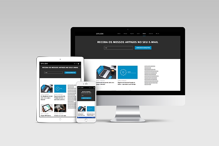
We have already approached several times the importance of responsive websites, but with data pointing to more use of smartphones than PCs, there is a question: should we not design websites first for mobile?
The ultimate goal is that visitors to our site have the best browsing experience possible, and that's the reason why many designers are designing websites' mobile versions first instead of what we got used to a few years ago: designing the desktop version and then adapt it to tablets and smartphones.
Gone is the theory that the mobile version of a website is a "small" version of the desktop version. Nowadays, people do most of the day-to-day tasks on mobile phones, so it's crucial to adopt intuitive design and rearrange content for easy reading. There are some notions about the mobile-first approach:
Simplify, Reorganize, Re-Hierarchize
Instead of adapting the structure and layout to the size of a mobile phone screen, the elements must be reorganized and rethought so that the user can navigate efficiently. Reducing the number of columns, increasing the size of the letter and changing the site itself requires an adaptation to the hierarchy of information also.
Less is more
Mobile devices are designed so people can do their everyday activities and use their tablet or smartphone at the same time. Thus, the attention of the user is already automatically reduced. Thus, it is important to preserve only the most relevant information and to leave aside the accessory.
The user must be quickly oriented to the content he seeks or needs to complete his task, as his attention time is being divided up with a number of other elements of the context in which he finds himself.
Draw for fingers and not mice
While in traditional computers, we have always been used to using a mouse, the basic mode of interaction of mobile devices is touch. Thus, it should be noted that what will touch the elements of the screen are fingers, with different shapes, sizes and pressure exerted on the screen.
All elements that need touch, such as forms, call-to-action buttons, etc., must be large enough so that there is no overlap with other elements and thus poor interpretation of the touch, which proves very frustrating for the user. All this does not exclude the need to test on multiple devices with different resolutions to ensure that the design in question works for each of the specifics.
Despite having many advantages, the mobile-first approach is not consensual. Some designers find it restrictive to design for mobile first, since having less space and sometimes fewer features limits them in terms of creativity and content presentation.
Thus, instead of the traditional "desktop-first mobile-second" methodology or the approach in which we focus on this article "mobile first - desktop second", there is a line of work that joins the previous two. The theory that mobile and desktop should be developed concurrently, page by page, has gained weight.
So, the designer designs the homepage of a desktop site while drawing it to mobile, with the appropriate changes, having a much clearer notion of how the site behaves in all resolutions.